Overview
Data visualization is a powerful tool that allows the transformation of complex data sets into comprehensible and insightful graphical representations. By presenting data visually, it enables the identification of patterns, trends, and correlations that might otherwise go unnoticed, making it easier to understand and communicate complex findings.
One of the fundamental concepts in modern data visualization is the Grammar of Graphics, which provides a structured approach to creating visualizations layer by layer. This concept is clearly interpreted in tools like the {ggplot2} R package, part of the {tidyverse} ecosystem, developed by Hadley Wickham in 2005. The Grammar of Graphics helps guide the creation of clear and concise visualizations, offering users a framework for combining data, aesthetics, and geometries.
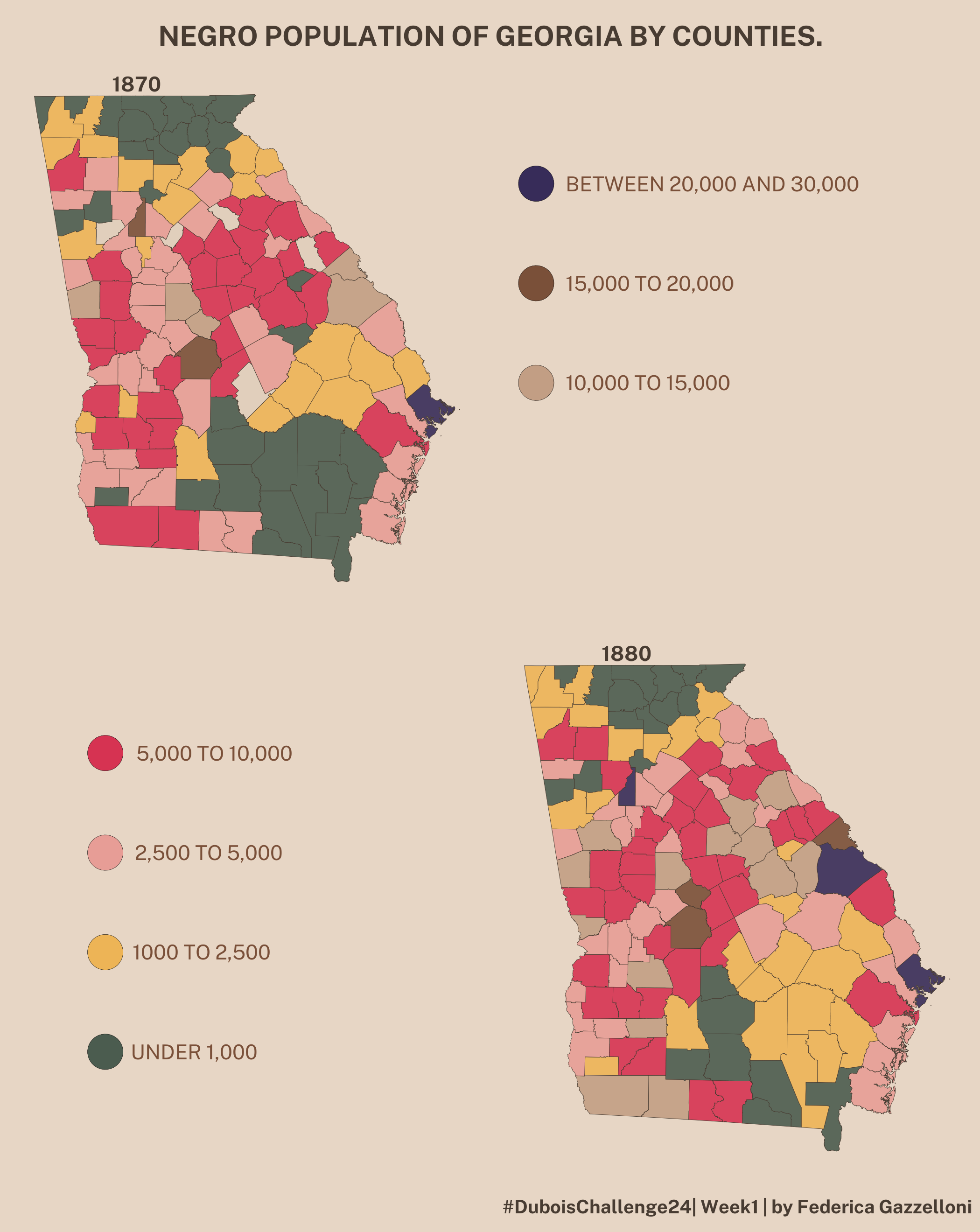
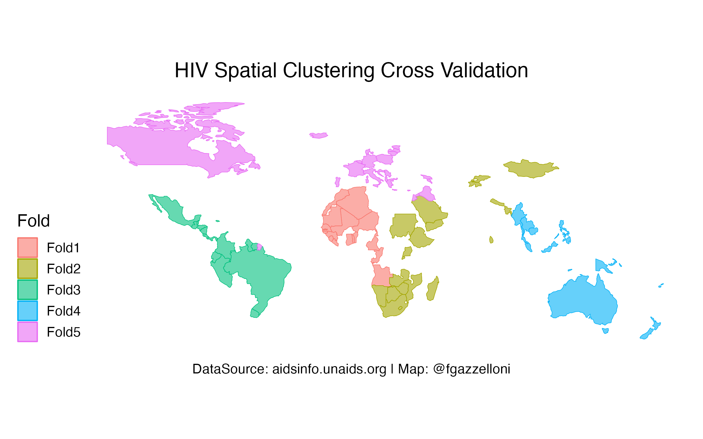
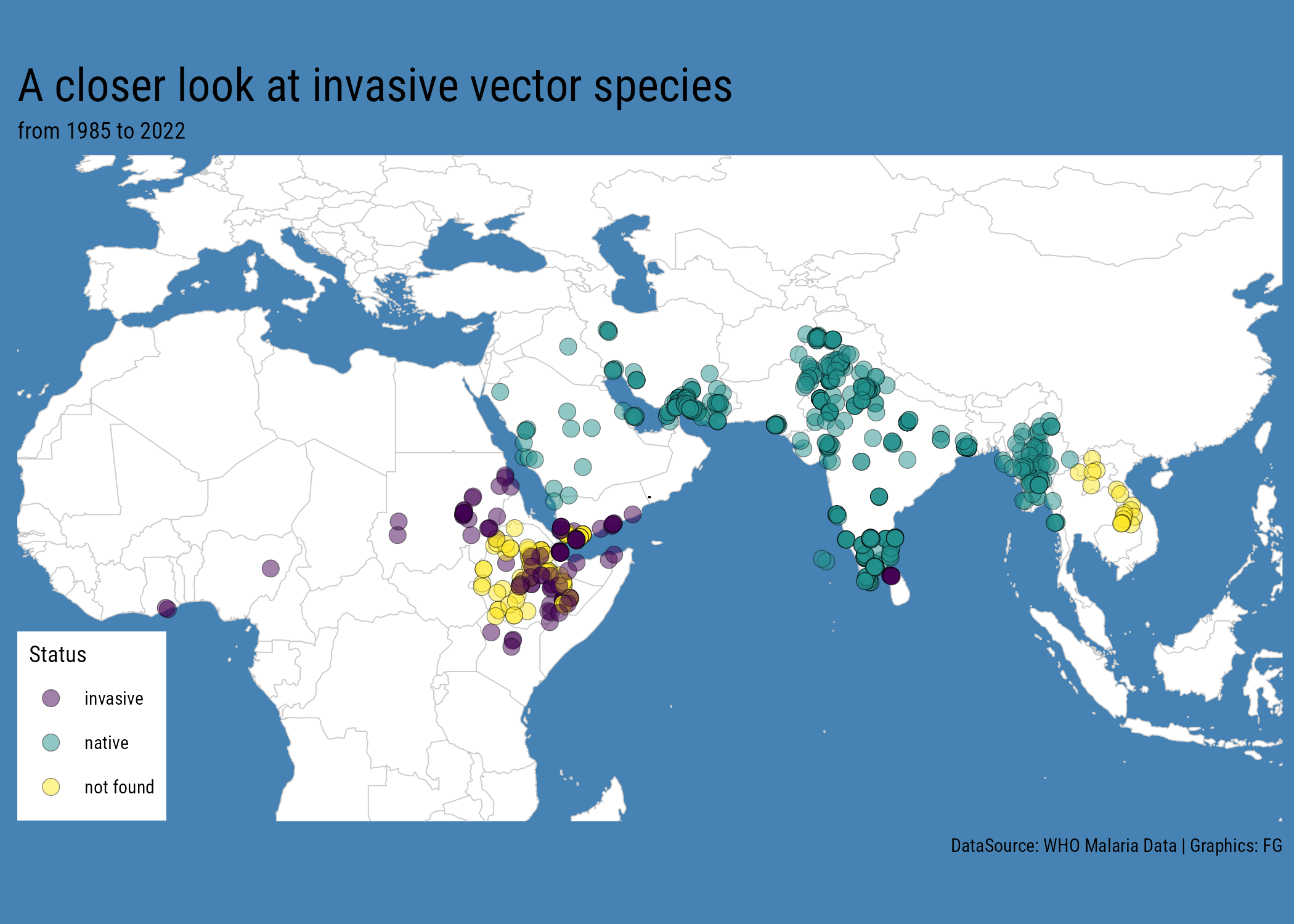
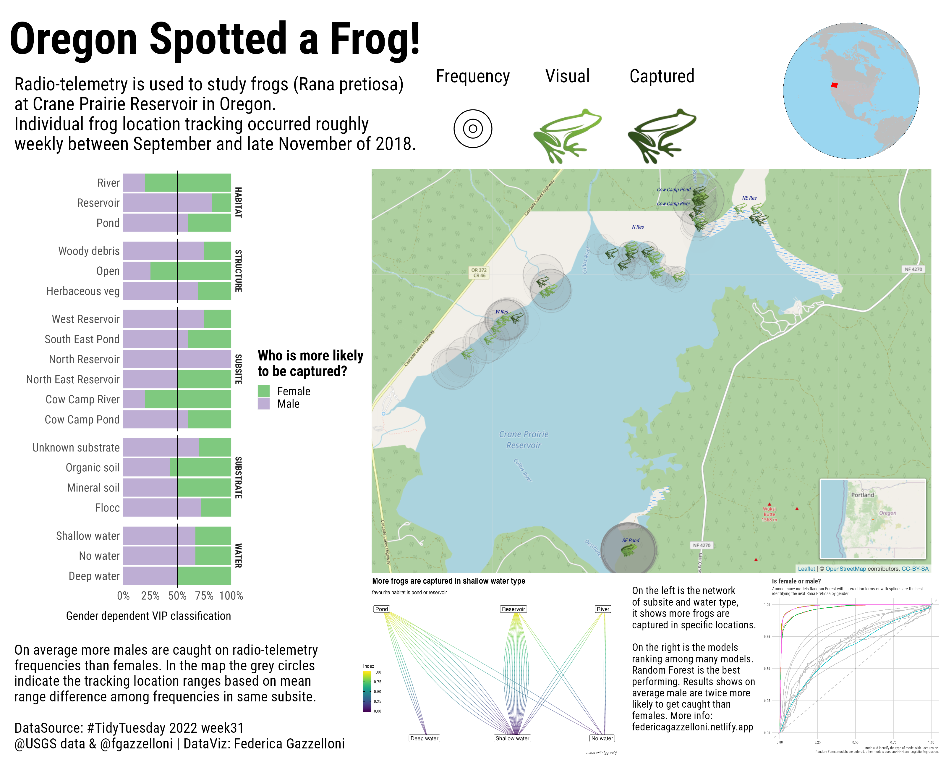
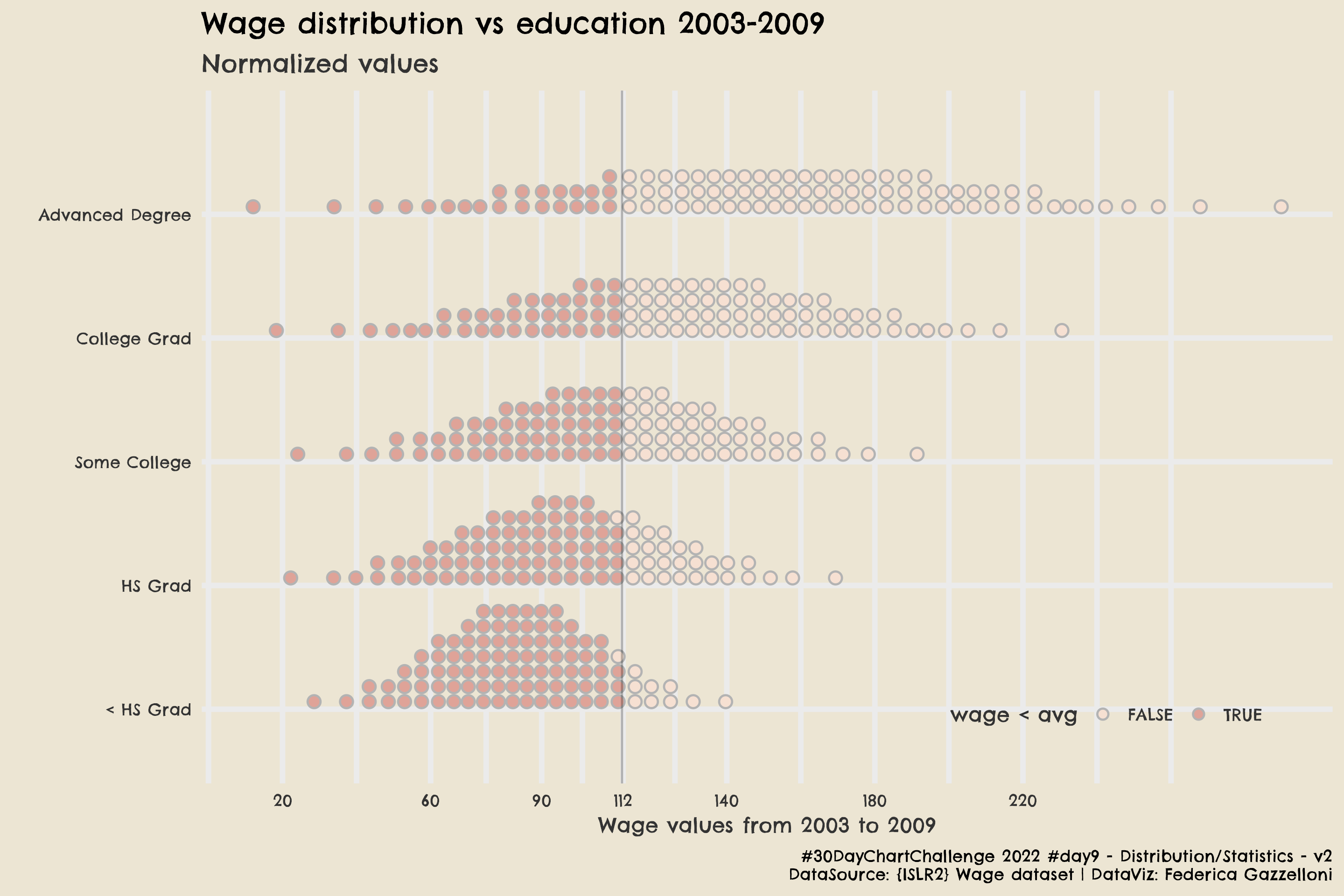
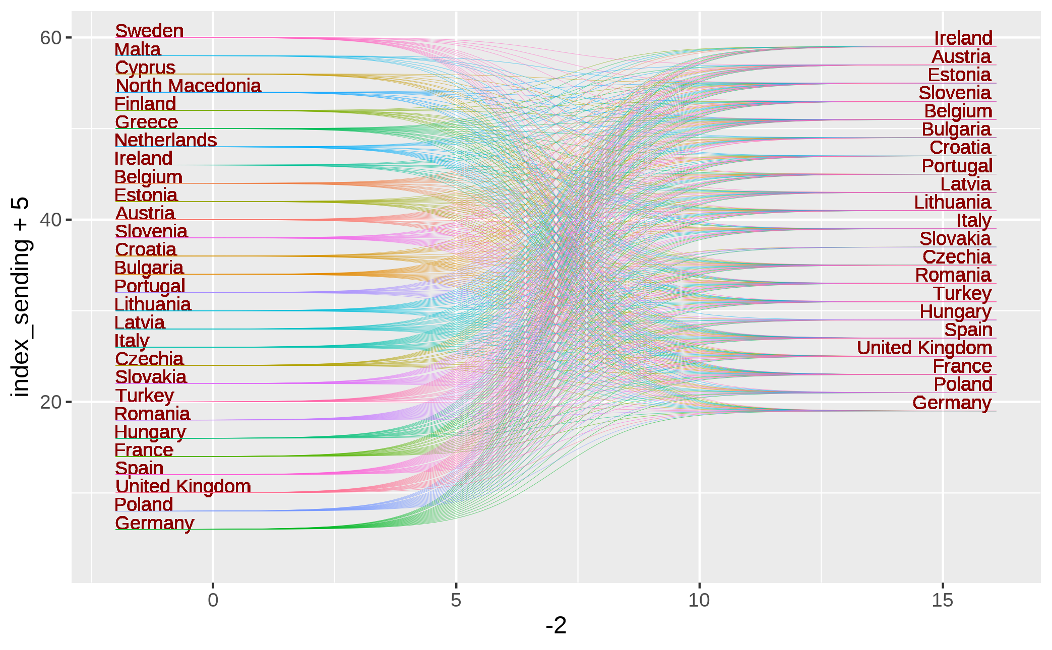
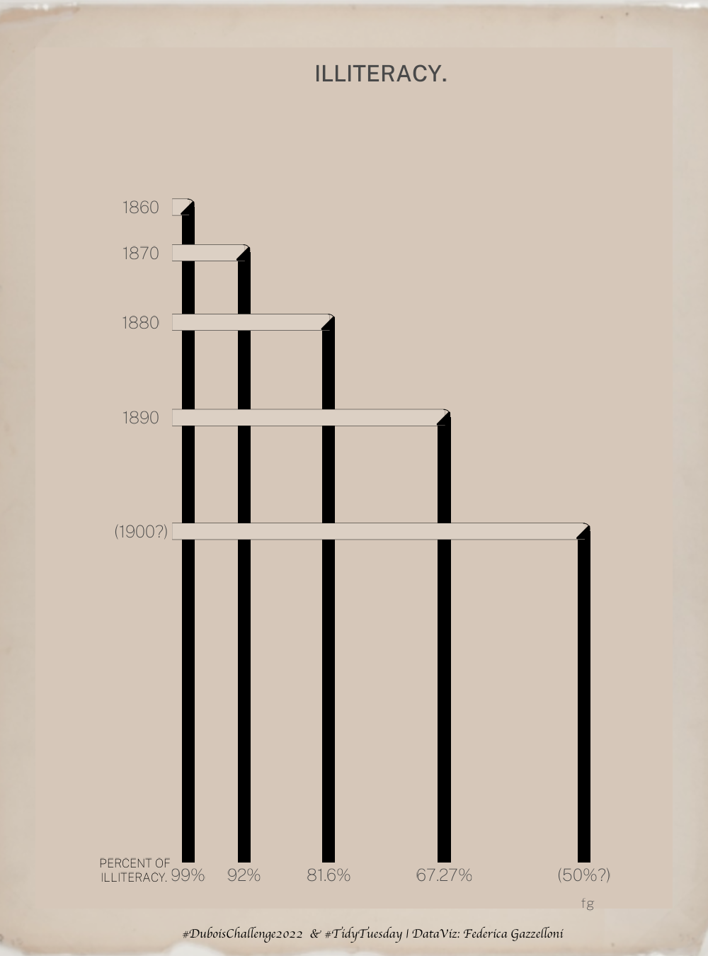
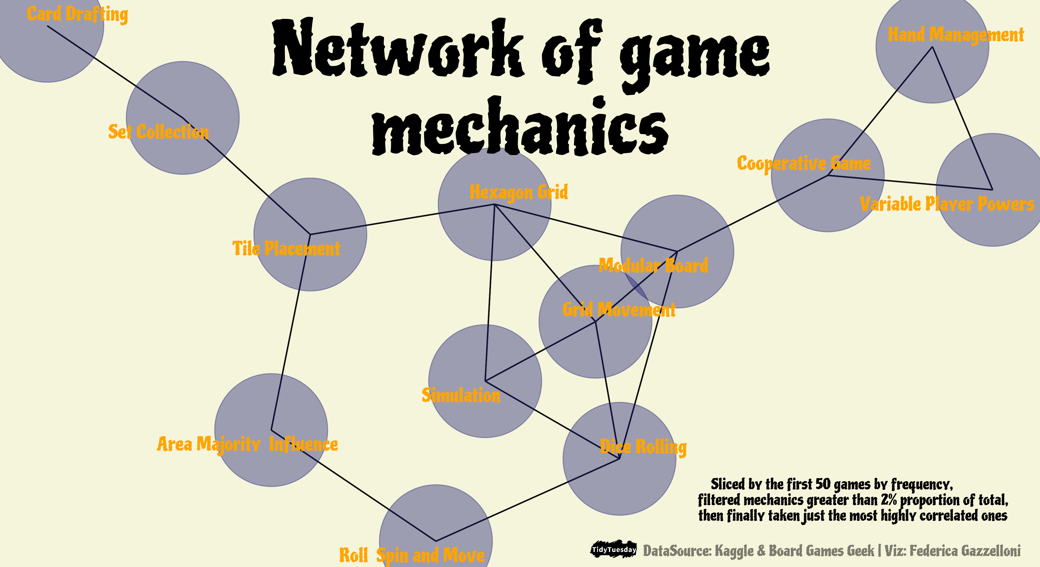
Here you’ll find a collection of my favorite Data Visualizations, showcasing a variety of themes and data sets. Each visualization represents my approach to conveying meaningful insights through graphs and plots. Whether you are interested in exploring health metrics, economic trends, or the spread of infectious diseases, my work emphasizes the power of visual storytelling.
For a more comprehensive experience, feel free to explore my full collection of plots and data visualizations at my UPDVwR website: Explore all Data Visualizations
